
/
The Art of Print: Marimekko
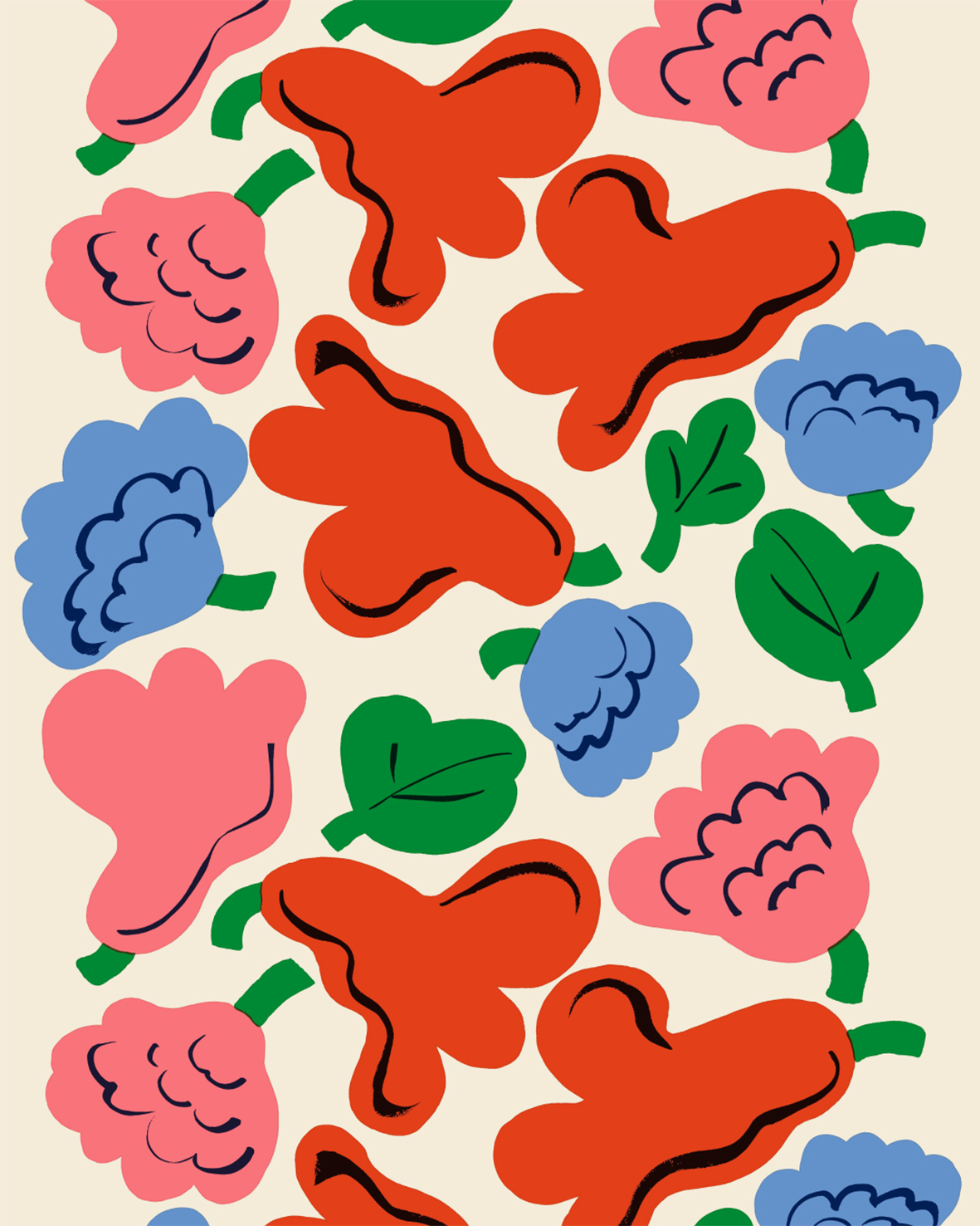
Cobalt blue. Poppy red. Sunflower yellow. Grass green.
Long winters often produce the brightest colours. Founded in Helsinki in 1951, Marimekko built its identity around bold prints that brought colour, optimism and freedom into everyday life. More than seven decades later, the Finnish design house continues to prove that print is not a finishing touch, but the foundation of an entire visual language. Even the name reflects that sense of simplicity. Marimekko combines Mari, a common Finnish first name, with mekko, the Finnish word for dress. An understated name for a house that would go on to create one of the most recognisable visual identities in fashion and design.
Flowers have always played a central role in that language. Not as delicate botanical illustrations, but as graphic compositions of simplified forms, expressive colour and confident scale. Looking at Marimekko, I often think of Henri Matisse. Both share a similar visual vocabulary, where organic shapes become almost abstract, colour takes precedence over realism and rhythm matters more than detail.
That multidisciplinary approach also explains why Marimekko feels perfectly at home during Milan Design Week. Fashion, textiles, ceramics and furniture have never existed as separate worlds within the house. They are different expressions of the same creative philosophy, united by colour, print and the optimism that has defined Marimekko since the beginning.
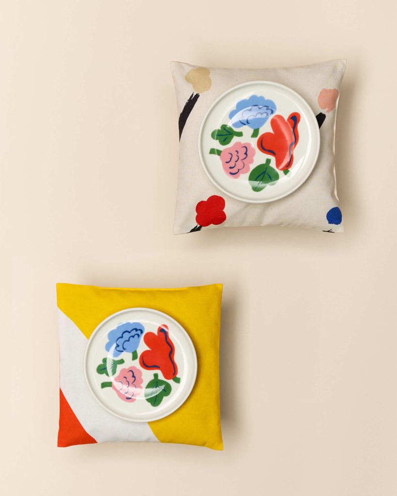
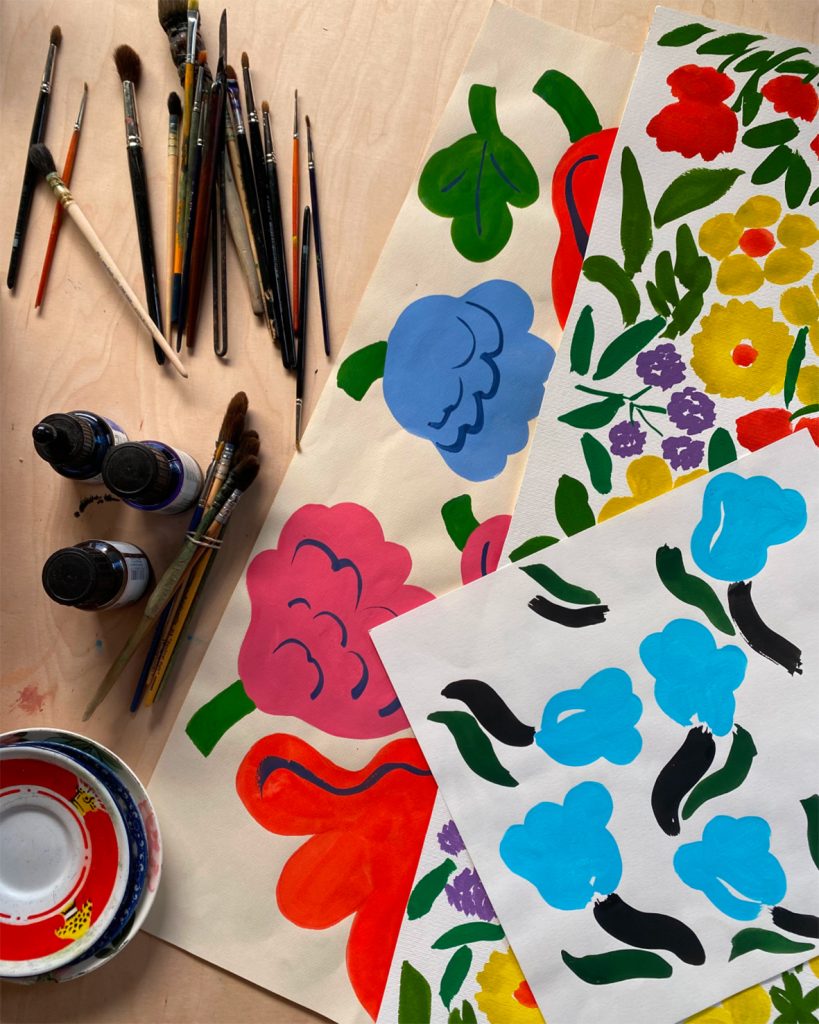
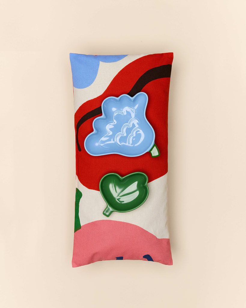
Images courtesy of Marimekko, presented during Milan Design Week
Images courtesy of Marimekko.
Presented during Milan Design Week.
www.marimekko.com